I want to suggest a little UI opimization on the windows desktop client.
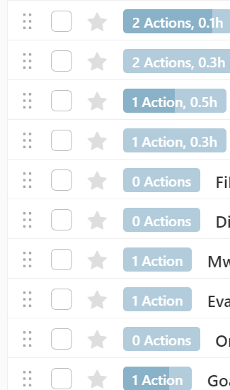
The blue action button should always have the same width. Now it looks different on nearly every row which makes the projects list a bit rough and bumpy to look at.
What do others think?
1 Like
I remember it used to be fixed width before the total time estimates were added.
Then the width was made flexible to avoid wasting space in situations like this
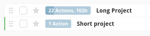
I do think fixed width is better. Maybe two width levels would work - one for short buttons and one for long.
1 Like
Sounds good to me, would add some more UI calmness.
1 Like
I really like the idea of two width levels!