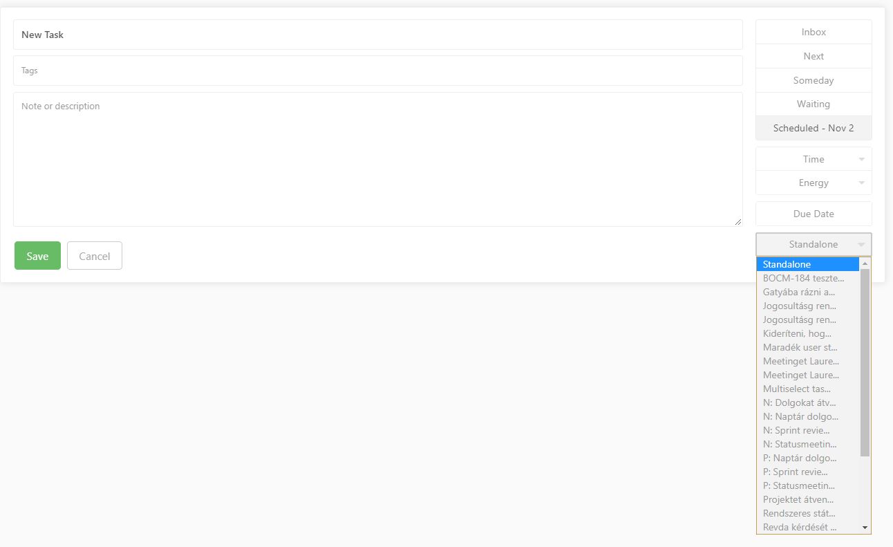
I usually use longer project names, that describe, what is the goal of the project. I also scaled the GUI to 1.10, or 1.20 (I don’t remember exactly, and I can’t check it now).
Actual:
When I assign a project to the given task, the application cuts the project name, and make it hard to find the right project.
Expected:
When I assign a project to the given task, the application shows the full project name, either by enlarging the project drop down list, or break the project name in multi line. Another solution also ok.