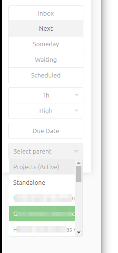
The project selector width is too short for long project names, see screenshot. There is no chance to find out the exact name of the project
I often have project names like
“#Ticket-1234567 long title- customer name”
So I don’t even have the change to read the complete title and see what customer the project is related to.
I have entered this as a bug. Originally I didn’t think it’s much of an issue since the field is intended to be searched. However I agree that it should be fixed if possible.
It didn’t look reasonably easy to fix last time I checked because of how the component works. The best that can be done is having a well styled horizontal scrollbar for the overflowing projects. However the usefulness of that is not clear. I think for now better to focus on something else.
I’d suggest placing the project selector between the tag selector and the note field. This way the project selector would benefit entirely from the native available screen estate.
Looks like I missed that post, sorry. I think it’s the best option so far. I like that it also makes the selector closer to the title, so few tabs would be required to navigate to it, unlike now.
I will try experimenting with this.
I created a ticket for this, but decided not to implement at that time. The problem is that this is a big change to one of the core user interfaces, so I’m not sure it’s a good idea to impose it on every user just to fix a relatively minor issue. What I really would like to do is to rebuild the whole editor UI, fixing all of its issues. That would at least justify breaking the existing user experience. Maintaining two version of the same dialog behind a config option is a poor approach as well.
I agree with the risk assessment of breaking big and well tested software components.
My workaround is to embed unique information in the first 20 chars or so. If you have any hierarchical stuff that you want to occur first, you can use abbreviations. e.g.
Work: Client7423: Project9433 becomes
W:C7424:P9433 and everything remains exposed in the interface as is.
Or, if you work on only a few projects and have really long names
Work: Client7839482394872: Project343234 can become
P343234:Client7839482394872:Work
You just need to differentiate between a few active projects, so just project name may be enough.
Hopefully you don’t have collisions in your project names, but that’s easily another workaround.
If you don’t want to change the ui, then please consider adding a quick tipp when hovering over the abbreviated project name. That’s industrie standard and expected behavior for things that are shortened.