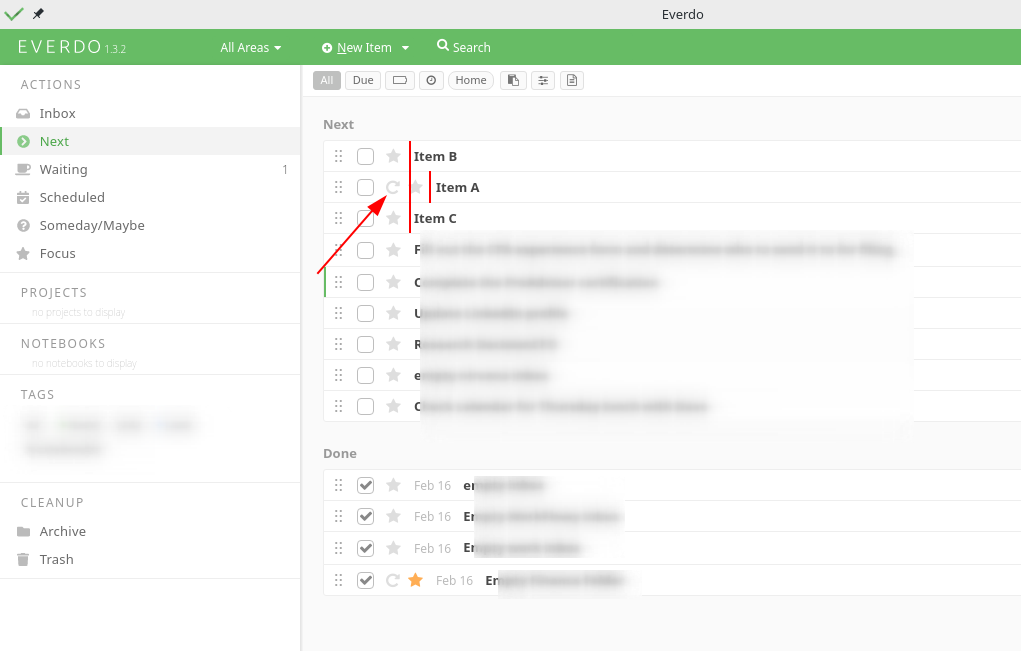
Hello,
Can we have this fixed so that the tasks all show up properly aligned? This really hurts my OCD.

Hello,
Can we have this fixed so that the tasks all show up properly aligned? This really hurts my OCD.

Mark, please suggest a way to fix.
I agree, the repeating item icon info could show up on the right side of the item text. If an item is repeating or not is a kind of secondary information.
The only other place I can see is before the tags.
Or maybe a placeholder?
Yep I think that’s the perfect place.
+1
I’ll try changing the layout as part of the next update.