Hear me out. I’m scanning my iPhone for task in whatever section ie projects or single category task, right. I swipe to the right and done comes out, ok, I see but why would I swipe right to complete the task if I could just tap the square and be done with the task as well. Do you see my point. So unless I like to swipe task I see this in my humble opinion as kind of redundant but I can see how people can be get used to it, I suppose.
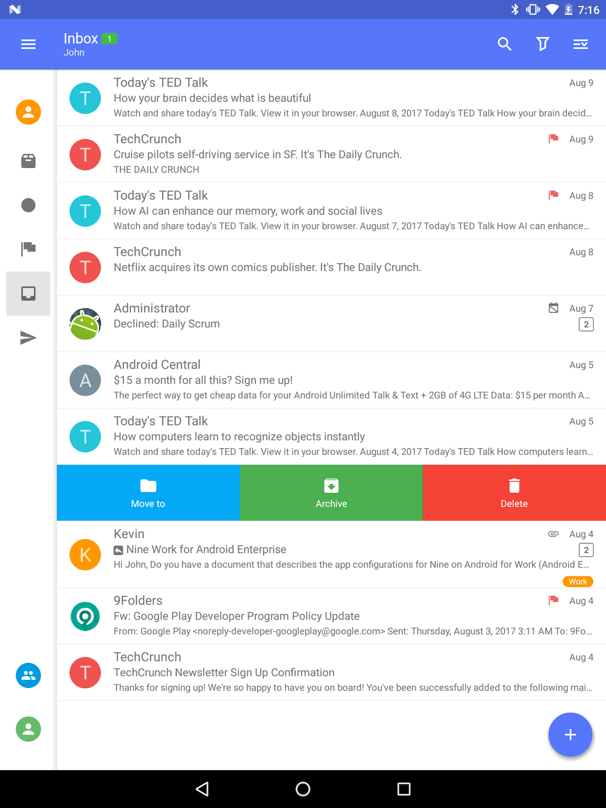
It would be nice to switch that function, not switch but let the user select what actions I would want in swiping. Lots of applications in iOS and Android have swipe options.
I would totally prefer to Swipe Right to Schedule. Since Schedule would automatically schedule the task for tomorrow it works out perfect.
In this scenario, I’m scanning my task in my iOS device (or Android) and I quickly plan my day for tomorrow by Swiping to the Right on Tasks. That would be super nice and useful I think.
As far as Swipe Left which is to Delete the task, I would prefer to have a Someday option.
It’s an interesting suggestion. I agree that the right swipe could be more useful if it served a different function. Completing actions is effortless already.
At the same time I’m not sure that a function like schedule for tomorrow would be obviously useful for many. For me personally, I tend to defer actions for 1-2 weeks, not 1 day.
I totally understand the way you defer items usually as you said 1-2 weeks but the default behavior on the desktop is not that, its for the next day.
If I drag an item to Scheduled on the desktop it will Schedule for tomorrow which is awesome I love it.
So by enabling this on Mobile via a swipe would follow the behavior of the desktop irrespective of one’s own individual methods, do you know what I mean.
I think my suggestion seems quite logical based on the behavior already established on the desktop. Adding the Someday to other swipe would be icing on the cake.
Either introduce a “default Schedule” option which is then used when swiping.
Or you could offer a few defaults when pressing “schedule” like Today, Tomorrow, This Week, This Weekend, Next Weekend, next Month, pick a date
I think up to three swipe actions could be placed for each swipe action (left or right), two might be sufficient.
Take a look at the nine e-mail app to see how they do it.

Definitely user customization is here the most comprehensive and convenient approach. Probably the most difficult to implement also.
In my case I can’t say that it is even a low priority for me as a user. If I have to choose one option I would choose scheduling but there must be an option to define the step. It can be a dialog to choose a date.
A very. healthy discussion so far, my initial point was to bring parity to the mobile app as far desktop behavior but all options discussed so far are very good as well.
Thank you everyone for your input. I think this feature is valuable and that multiple actions per swipe approach is preferable to customization. I will add this to the backlog as “Redesign swipe actions”. However, item processing is already not bad on mobile. It takes 3 taps to move an item to Someday/Schedule, for example (open/change list/save), as opposed to just one careful swipe after the proposed change. So the swipe changes will be low priority.