We want to make Everdo as pleasant to look at at possible.
This is difficult because of multi-platform nature of the app - things look a bit different across operating systems, not to mention different screens. Your help is needed.
Please attach screenshots of the areas that you find:
Hmm I am not sure looks a bit lighter on my screen. A little more contrast would help in the highlights or if possible adding subtle animation of scaling them by a bit and adding box shadow when highlighted might help make it more legible too.
I found that a bolder highlight color stands out too much - it distracts from the task list area, which is where the attentions should be most of the time.
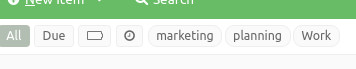
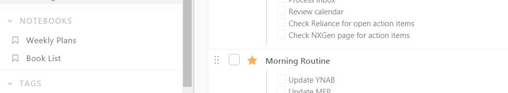
I have two areas that I’d like to see a bit more contrast. You Id’d the first with checkboxes. The second wouuld be the headers in the menu on the left side. The info below them seems dard enough but the headers could maybe use a color tweak. In my example, I’m speaking of Notebooks and Tags…not a huge issue either way.
I think let’s first try to make the default theme look well - it’s much easier to do and won’t distract the development effort. Then we will see if further customization is needed.
Everything suggested here so far has been addressed and is scheduled for release in 0.16 early this week.
The changes are mostly subtle, but in the right direction.
Really appreciate everyone’s input so far! Please share if you notice anything else.
For me the contrast in the whole application is off. Looking at the screenshots of others, that seems to be the case for others, too. This unfortunate “design” trend in recent years of using grey fonts on grey background makes text just unreadable.
Why not simply use a black font colour throughout the app?
Using different shades of grey helps to (de)emphasize certain areas of the user interface. In Everdo specifically, the item’s titles are what should draw the most attention, which is why they have the highest contrast. Navigation elements, on the other hand should draw as little attention as possible.
The “black on white contrast is best” argument is valid for text, which you are supposed to read for prolonged periods of time. Apps are not websites or books, and the user is certainly not supposed to spend more than a few seconds “reading” the navigation elements.
Smaller fonts look especially bad black-on-white (jagged edges). Making the contrast lighter helps. Apps often use small fonts to get secondary content on the screen at once.
We want to achieve a balance of good looks and readability. It’s clear to me that more contrast is not always a good thing for an app. If you are on Windows, try enabling one of the high-contrast themes. I don’t think many users would be pleased with an app designed like that.
I’m not saying it’s perfect at this point and agree that things can certainly be improved. We do encourage and implement specific improvements as they are suggested.
I think it’s great that you want the app to look as good as possible, I really do. But if people cannot read their tasks properly, they cannot use the app. It really is that simple.
Concerning your specific points:
Sure. Nirvana also uses different contrasts and grey texts at some places, but the contrast of the tasks themselves are much higher (and the font size is also larger), making them much more readable.
The argument is not about black and white, but high contrast in general. And I certainly spend more than a few seconds in my task manager, reading and managing my tasks.
Exactly. Why not make them larger then? They are much smaller then in Nirvana.
The high contrast theme is an extreme example of course, but at least it is very readable (which also is the point of that theme). As I said before, a beautiful design is a nice thing to have, but in my opinion it comes after readability.
I like Everdo, but the contrast is way too low. It would be a real improvement to get some kind of options to change the font color. Or an alternative theme. Something. I find it challenging at time to work with everdo because of the low contrast.
The heading is nice and easy to read. But the rest of it… I don’t know how to explain this. But this bright grey font just isn’t very helpful.
So overall the app looks beautiful. And I completely understand why it looks how it looks. But in my opinion “productiveness” (not sure if this is a real word) is way more important for this kind of app.
Anyhow, thanks for this great app! And sorry for my bad English.
A dark theme should be the highest priority. Many people consider light grey text on white background to be a “deal breaker” (meaning they will switch to another app on this basis alone.)
This would seem to me a contrast issue. It could be fixed by having a “high-contrast” setting which would make the UI “bold black on white” instead of “light grey on white”. That said, I don’t think there are really places in Everdo where important text is in light grey (please do point out if you see any). The titles of items are almost black and the descriptions are a bit lighter. The font sizes are smaller in some places, so some labels may look lighter than they really are.
Themes are a different and much more complicated feature. It’s also much less critical compared to some other suggested features.
In any case, this topic is exactly for finding and fixing contrast issues, but implementing support for themes is not the way to fix it, at least not now.