Some users have reported the crash from using the “+” button. It should be fixed in today’s release.
Not sure yet.
Some users have reported the crash from using the “+” button. It should be fixed in today’s release.
Not sure yet.
I am not sure but I think that after today’s update the font that is used with tags is strange…
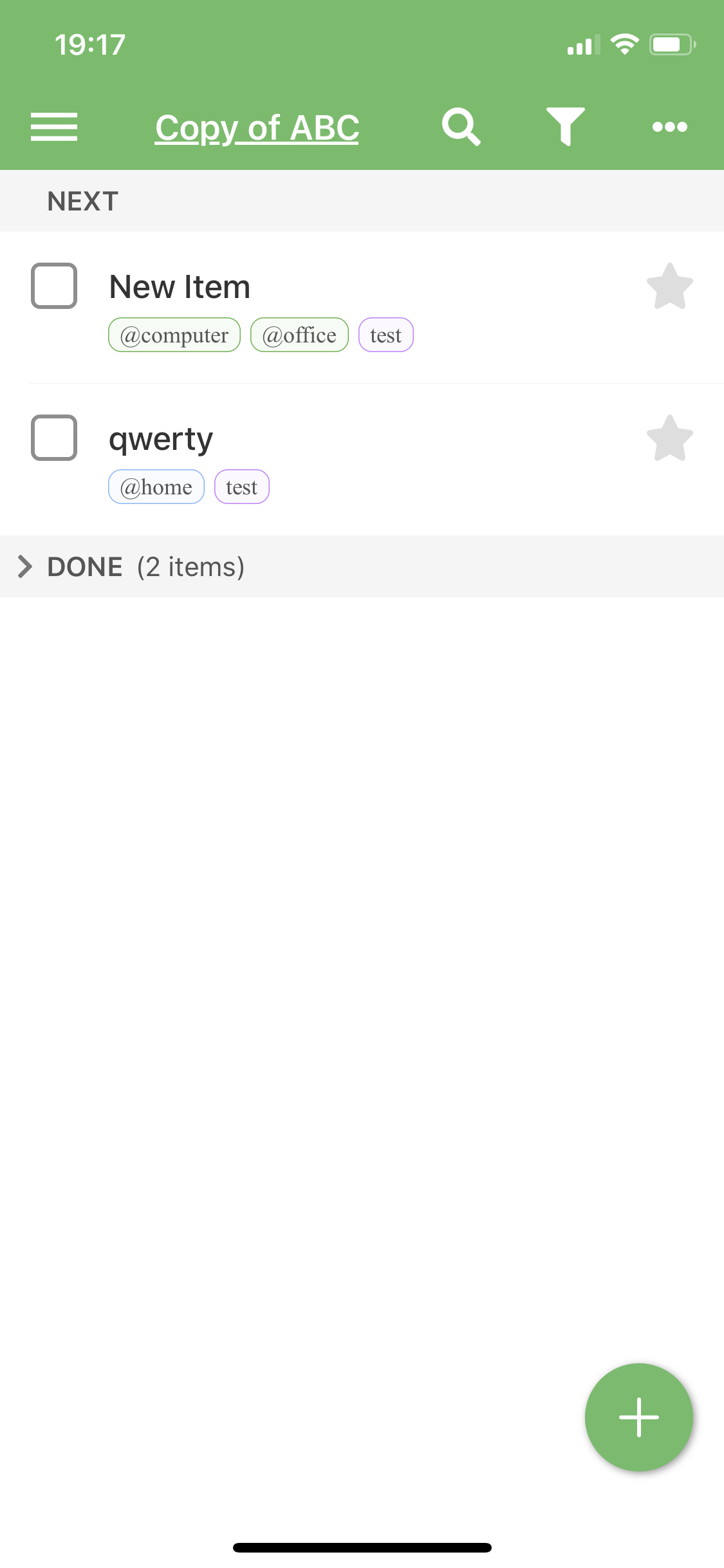
Edit:
After today’s update it is almost impossible to hide the keyboard during adding new item. Impossible to set tags and other attributes
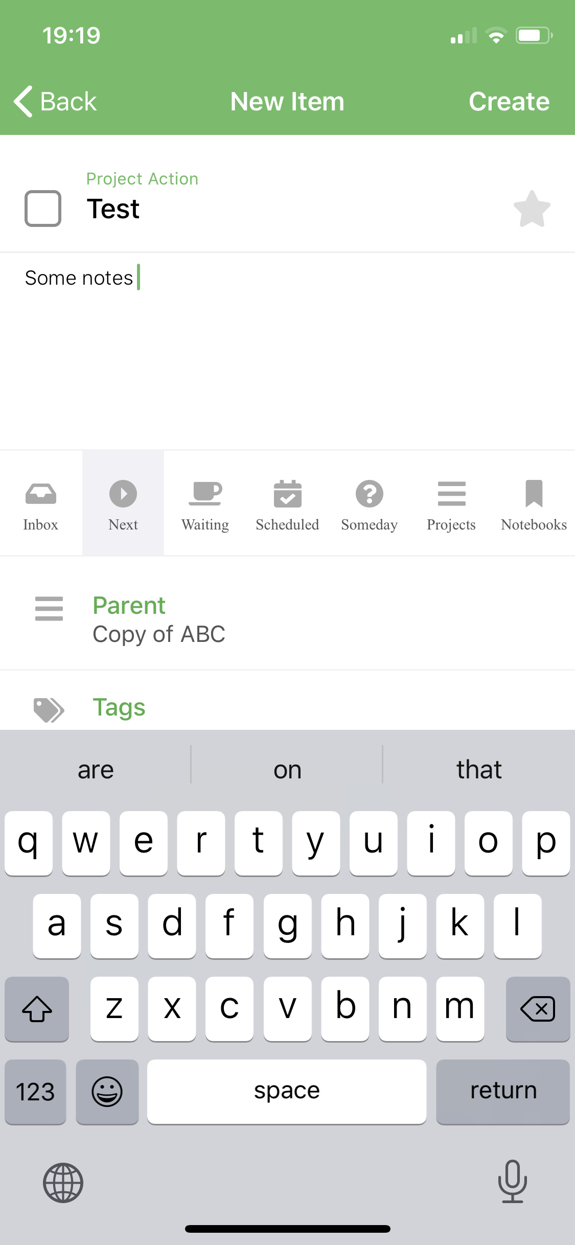
The app was only rebuilt with the new version of xcode. I guess they changed something. If the previous build (6) worked for you then you can install it via TestFlight.
Independently on version there always should be a key “done/ok” do hide a keyboard.
Are you sure that font is changed just because of re-compilation?
Today’s update resolved font issue
The areas list is sorted from z->a. Should be conversely.
You are right! So strange 
When we close a project which has undone tasks these tasks aren’t marked as done. When we archive done items we can see that project on the Archived list but there are no tasks. Project label shows that there should be tasks but when we open archived project it’s empty.
A few improvements and bug fixes have been rolled out today. Particularly, many of the issues reported in this thread.
A notable change is the option to not repeat a scheduled item until the previous copy is complete or deleted. It is only available in the iOS app for now, which means that it will be ignored by the Desktop app. So after a sync run you’ll still have duplicates created. This is normal until the upcoming Deskop update.
I was unable to replicate this issue so far. When I archive a project in the iOS app, it completes all sub-actions and moves everything to Archive. Then opening a project shows all sub-actions as required.
Great update, thanks!
Hi Andrei! After last update, 1.0 (10), the app crash every time on launching. Already sent the report via Testflight. Reverted to previous version 1.0 (09) which is working fine.
Thanks for reporting!
Does it crash before any of your actions become visible, or do you get to see some data and then it crashes?
Not every user has this crash. It is probably specific to a particular combination of scheduling settings of one of the actions. It is safe to revert to the previous build if needed. Meanwhile we are looking into the problem.
@ context not mapping correctly between linux Everdo and IOS everdo. I thought I was doing something wrong, I would add @name to a context in a task but the @name would never get caught for the context on the ios platform.
When I would go look at my synced (via Encrypted Sync) on my linux workstation it would have the context updated in the context with the task. On the IOS platform it just shows that the context is added in properties but just in my inbox, where I created it and not also in the context view.
Steps:
Create a project and add three tasks
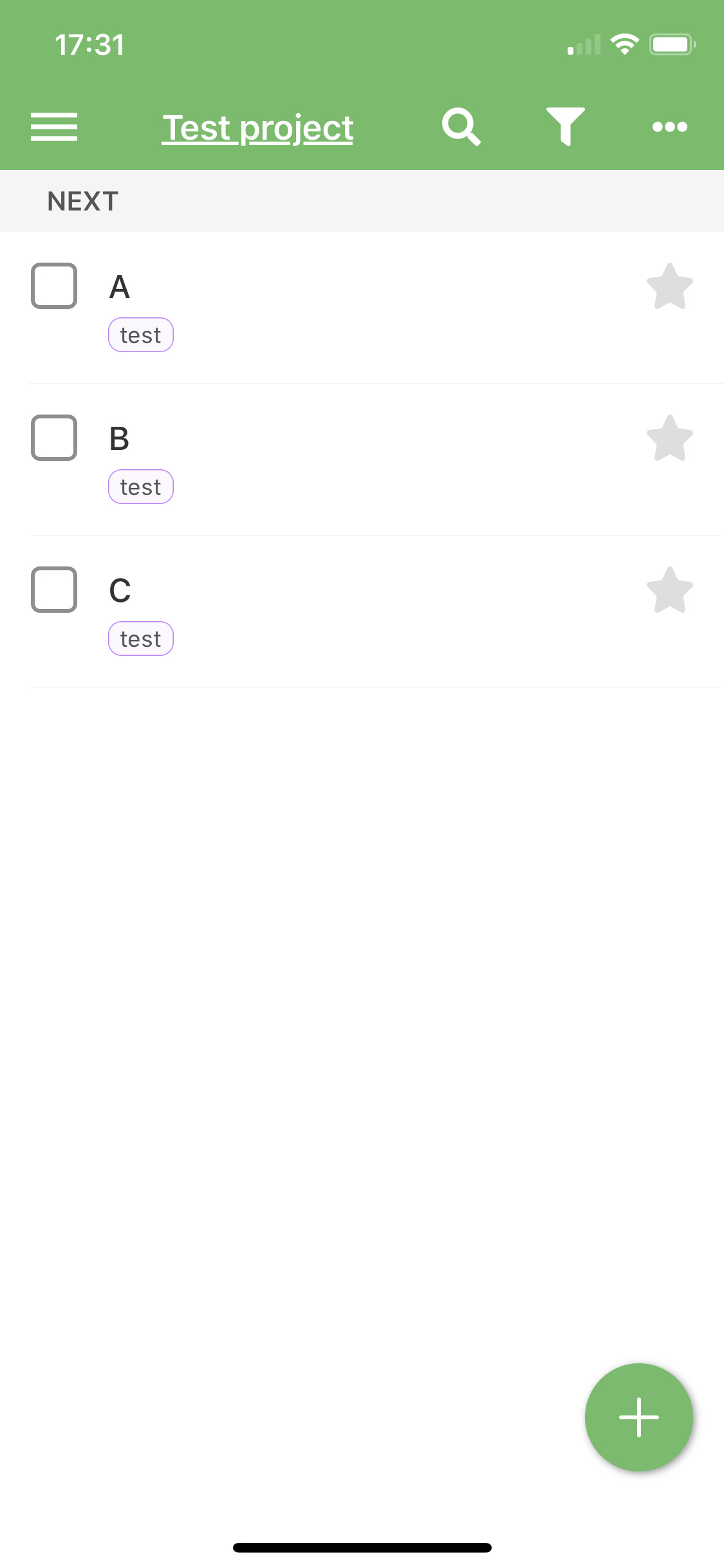
Finish one task
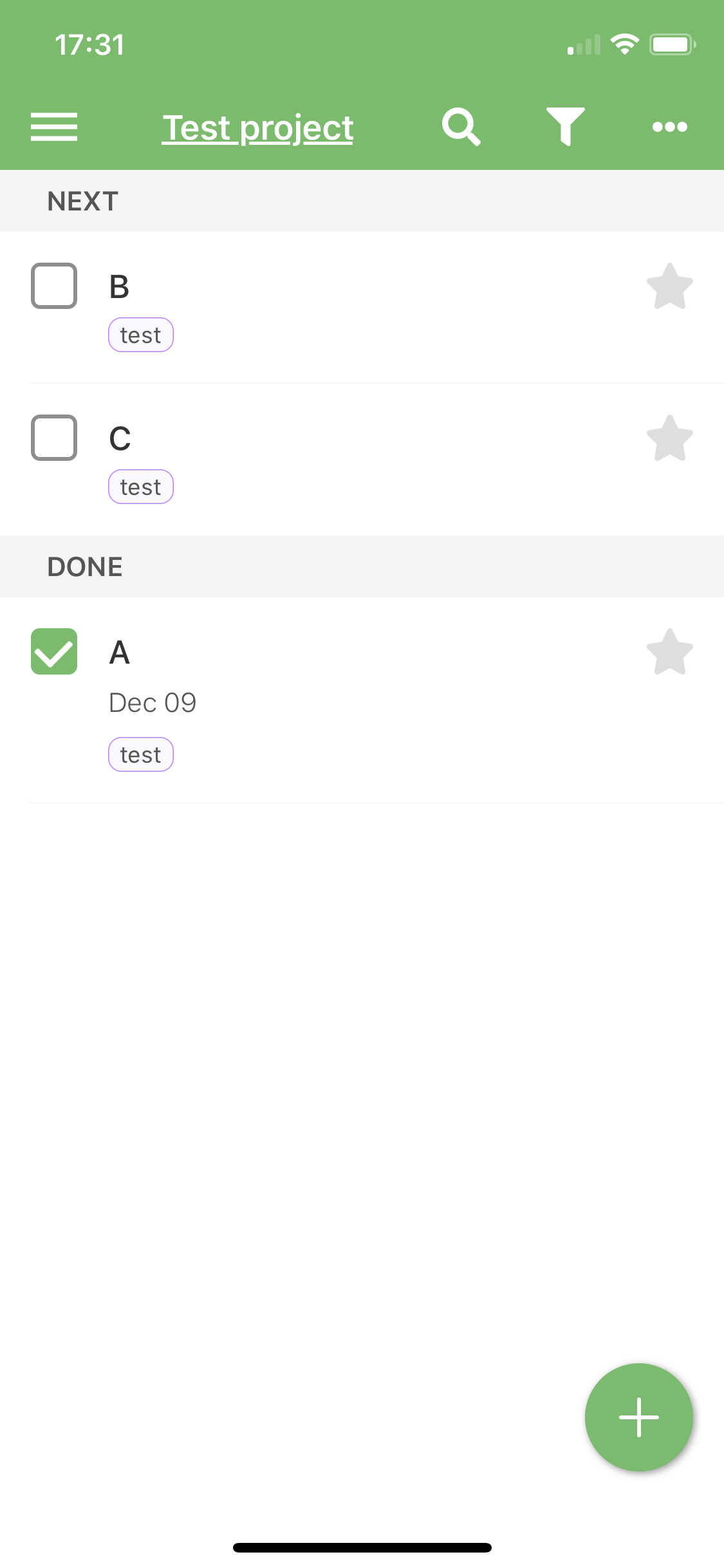
Finish whole project and archive it.
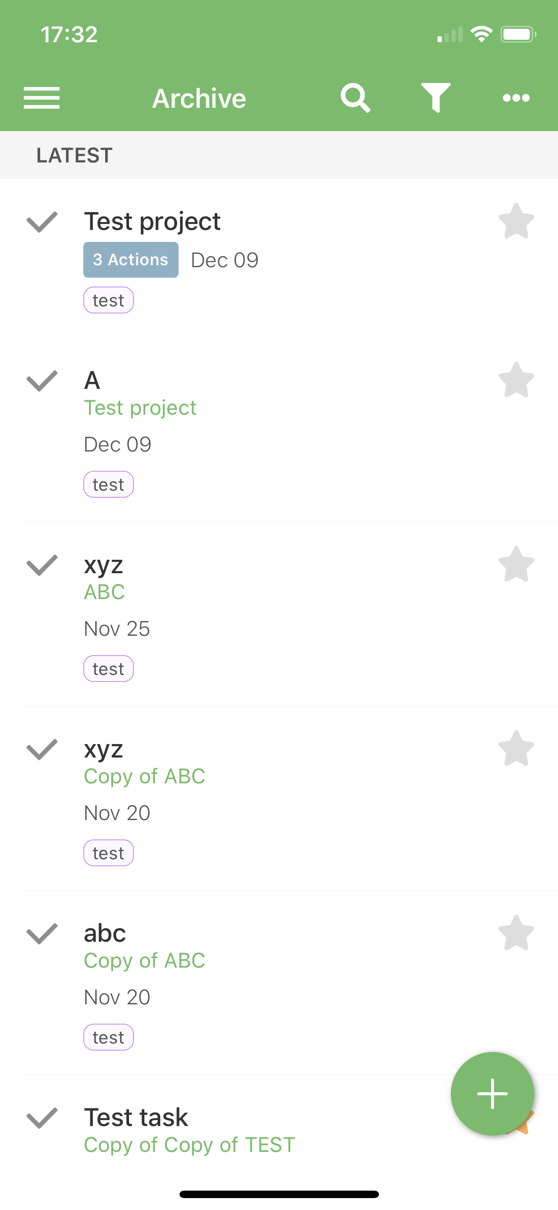
The project label says there are 3 items within it. When we open the project there is only one item. Finished one.
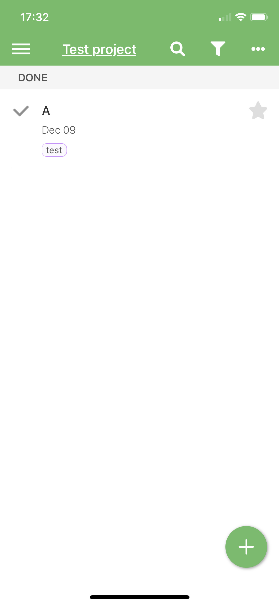
What is even more strange when I pressed archive then all three items were on the list but after opening the project two unfinished disappear.
By opening project I mean pressing the rectangular label.
Screen shot of task with @context

This should be fixed in today’s build. Archival of projects didn’t work properly on iOS, and when synced with Desktop, it caused this behavior.
@Carloszap This issue is less clear, as I only have two reports and it seems to be related to some specific scheduling setup. It may also be caused by a bad item created in an older (bugged) build of the app. I have fixed some places that were likely to cause issues, but if that doesn’t help, we’ll diagnose it further.
@coldiso
It looks like Inbox items don’t show in the @context view, unlike in the desktop app. This will be fixed in a few days. But if you apply the tag to say, a Next item, then it will show.
Each list keeps its scroll position. When we scroll Next list let’s say to the middle position, change the list to the different one and go back to the Next list. The scroll position is remembered. I think more expected is scrolling position to the top each time when we press the list button on the side panel. What do you think?
I don’t know, sometimes it would be better to have scroll reset, but most of the time I think it’s annoying. For example, if you need to review a long list and you want to switch to a different list in the middle of the process.
Matter of preference here I’d say - I prefer the position being remembered so it takes me back to where I was.